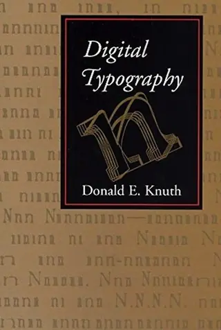
Digital typography
by Donald Knuth · first published 1999
35% recommend65% neutral
Why HN recommends it
Collection of Knuth's writings on TeX, METAFONT and computer typesetting, mixing technical detail with historical chapters; recommended as an absorbing read for anyone interested in how digital type and typesetting work.
Summarised by Claude from recommending comments
Affiliate links. As an Amazon Associate I earn from qualifying purchases.
Mentions per year
What Hacker News says
Related books
 2020–2021
Computer Modern Typefaces
Donald Knuth
0 recommend · 2 mentioned0 recommend · 2 mention0 recommend · 20 recommend
 2007–2023
METAFONT
Donald Knuth
Recommended by 1 · mentioned by 121 recommend · 12 mention1 recommend · 121 recommend
Computers and Typesetting
Donald Knuth
Recommended by 6 · mentioned by 146 recommend · 14 mention6 recommend · 146 recommend
The concept of a meta-font
Donald Knuth
Recommended by 2 · mentioned by 22 recommend · 2 mention2 recommend · 22 recommend
 2007–2026
The art of computer programming
Donald Knuth
Recommended by 336 · mentioned by 1,125336 recommend · 1,125 mention336 recommend · 1,125336 recommend
Database Internals
Alex Petrov
Recommended by 31 · mentioned by 4631 recommend · 46 mention31 recommend · 4631 recommend
 2008–2026
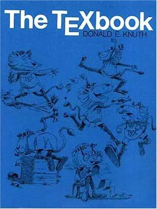
The TeXbook
Donald Knuth
Recommended by 25 · mentioned by 4325 recommend · 43 mention25 recommend · 4325 recommend
 2007–2026
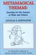
Metamagical Themas
Douglas R. Hofstadter
Recommended by 45 · mentioned by 8445 recommend · 84 mention45 recommend · 8445 recommend
…"leave that to the printer" (hope they can get good bids without the pre press estimate), so the variety of pre press tools widens to include just LaTex and a impostor for separations/plates. Knuth's Digital Typography, is a excellent read, and a chapter in that, showing by how much, and how easily, major press titles can be made more readable, save space, and more, became a brilliant sales tool for my consulting. If…
on “First introduction to LaTeX” ↗Donald Knuth also has two nice chapters in "Digital Typography".
on “Ditherpunk: The article I wish I had about monochrome image dithering” ↗I would also highly recommend "Digital Typography" by Knuth. It contains a more detailed description of the algorithm as well as many interesting historical and technical chapters on TeX, MetaFont and computer typesetting in general.
on “Knuth and Plass line breaking algorithm in JavaScript” ↗…"designing"." A lot of people care about the finer points of typography. If you really want to see some "circle jerking disguised as designing" take a look at a book by this nutjob named Donald Knuth: Digital Typography by Donald E. Knuth (Stanford, California: Center for the Study of Language and Information, 1999) "Or when he commits binary and swapfiles into his git repository." Committing binary files is such an…
on “Typography Spacing Research” ↗I have a printed copy of Knuth's "Digital Typography" on my desk (hardcover from 1999). The table of contents does not look too great, but the rest of the book is a piece of art in itself.
on “The LaTeX Font Catalogue” ↗12: Knuth - Digital Typography.
on “Ask HN: Best books on various CS related topics?” ↗…style f programming would gain traction and that there would be more instances of taking famous programs and re-writing as a Literate Program, e.g., http://literateprogramming.com/adventure.pdf - Knuth _Digital Typography_ (and not just because I have a reward check) - Knuth _Mathematical Writing_ --- if you do any work in math, you probably already have a copy --- if you don't, you probably need one - Dewdney _The Planiverse_…
on “Show HN: Books mentioned on Hacker News in 2025” ↗The character S also has its own chapter in Knuth's "Digital Typography": https://www-cs-faculty.stanford.edu/~knuth/dt.html The half-tone chapter is also quite cool.
on “Metafont (1984)” ↗…wanted to be able to retain the same quality already achieved, instead of having to solve all the problems anew. I wanted to design something that would be still usable in 100 years. ” – Donald E. Knuth: Digital Typography, p. 559 (quoted from http://de.wikipedia.org/wiki/TeX ) https://en.wikipedia.org/wiki/TeX "Even though Donald Knuth himself has suggested a few areas in which TeX could have been improved, he indicated…
on “Software That Lasts 200 Years (2004)” ↗…along, I wanted to be able to retain the same quality already achieved, instead of having to solve all the problems anew. I wanted to design something that would be still usable in 100 years.” (from "Digital Typography" by Knuth)
on “32 Years of Metafont [pdf]” ↗…call it a design doc), completely describing what TeX "does" (he wrote it in the present tense), how it works, etc., months before writing a single line of code. (See TEXDR.AFT and TEX.ONE, published in Digital Typography.) Even later, when TeX completely changed between its earlier version (the one written in SAIL, aka TeX78) and the current version (written in WEB, aka TeX82), the program has completely changed, but…
on “Readme-Driven Development (2010)” ↗…code was written. This was the first thing he typed up into a computer, after about two months of thinking about the problem. About a month later it was refined to TEX.ONE (both since republished in Digital Typography, along with some of Knuth's diary entries from the time). This is the specification that his two students, Plass and Liang, tried to implement from, while he was in China. Then he came back and decided…
on “Gall's Law” ↗…Halftones", originally published in TUGboat (the magazine of the TeX Users Group), Volume 8 (1987), No. 2: http://mirror.tug.org/TUGboat/tb08-2/tb18knut.pdf (Reprinted with revisions as Chapter 21 of Digital Typography.) Though it technically mentions "ordered dither" (on the first page), it uses it in a different sense/purpose (to get an initial patterns of dots that make up a "font" called "odith"). It does do error…
on “Show HN: Ordered Error Diffusion Dithering” ↗"A mathematical formula should never be 'owned' by anybody! Mathematics belong to God." Donald Knuth, Digital Typography, ch. 1, p. 8 (1999)
on “Thanks to NFTs, you can own a piece of Bayes Theorem” ↗…itself is not really complex I'm not sure if we're getting hung up on the word "complex", but here's 60+ pages on paragraph line breaking alone: http://www.eprg.org/G53DOC/pdfs/knuth-plass-breaking.pdf Digital Typography is 700 pages long (not everything is going to be TeX fundamentals, but...): https://archive.org/details/digitaltypograph0000knut/page/n7...
on “Sile: A Modern Rewrite of TeX” ↗