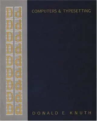
METAFONT
the program
by Donald Knuth · first published 1986
8% recommend83% neutral8% critical
Affiliate links. As an Amazon Associate I earn from qualifying purchases.
Mentions per year
What Hacker News says
Related books
 2010–2026
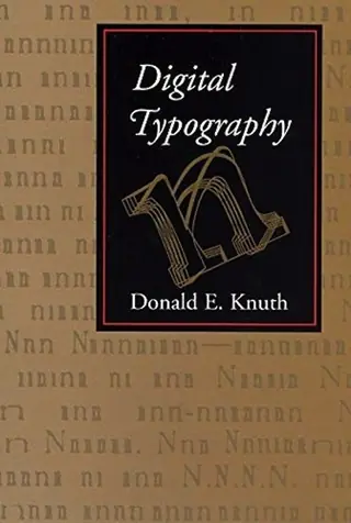
Digital typography
Donald Knuth
Recommended by 6 · mentioned by 176 recommend · 17 mention6 recommend · 176 recommend
 2010–2026
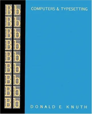
TEX
Donald Knuth
Recommended by 12 · mentioned by 3312 recommend · 33 mention12 recommend · 3312 recommend
Computers and Typesetting
Donald Knuth
Recommended by 6 · mentioned by 146 recommend · 14 mention6 recommend · 146 recommend
 2010–2026
Sorting and searching
Donald Knuth
Recommended by 10 · mentioned by 2510 recommend · 25 mention10 recommend · 2510 recommend
 2007–2026
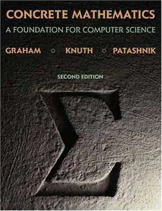
Concrete mathematics
Ronald L. Graham, Donald Knuth, Oren Patashnik
Recommended by 140 · mentioned by 215140 recommend · 215 mention140 recommend · 215140 recommend
 2007–2026
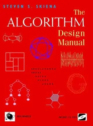
The algorithm design manual
Steven S. Skiena
Recommended by 195 · mentioned by 265195 recommend · 265 mention195 recommend · 265195 recommend
 2007–2026
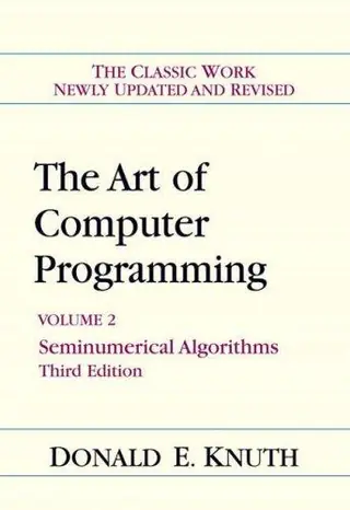
The art of computer programming
Donald Knuth
Recommended by 336 · mentioned by 1,125336 recommend · 1,125 mention336 recommend · 1,125336 recommend
 2007–2026
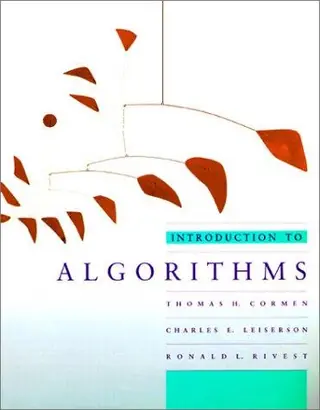
Introduction to Algorithms
Thomas H. Cormen, Charles E. Leiserson, Ronald L. Rivest, Clifford Stein
Recommended by 274 · mentioned by 712274 recommend · 712 mention274 recommend · 712274 recommend
You also get to see how "real typefaces" are produced using Metafont (namely, doing outlines and then filling them), which may not be crystal clear when reading the Metafontbook alone. (I also like the book for a much simpler reason: it got me my Knuth cheque)
on “Metafont (1984)” ↗…mf.web to generate TeX sources for a camera-ready, exhaustively commented version of the source code that has even been published in hardcover[1]. [1] http://www.amazon.com/Computers-Typesetting-Volume-Metafont-...
on “The Art of Computer Typography” ↗…it looks great. The reason is that Knuth uses bitmap (raster) fonts, not vector fonts like the rest of the world. Once bitten by “advances” in font technology (his original motivation to create TeX & METAFONT), he now prefers to use bitmap fonts and completely specify the appearance (when printed/viewed on a sufficiently high-resolution device anyway), rather than use vector fonts where the precise rasterization…
on “Knuth on Huang's Sensitivity Proof: “I've got the proof down to one page” [pdf]” ↗Knuth wrote the entirety of the first version of TeX on yellow legal note pads, and then typed it all in, and then started debugging. Ditto for MetaFont. Both are the equivalent of about 10kloc (after the Tangle preprocessor removes the voluminous comments).
on “CS Unplugged: Computer Science Without a Computer” ↗…in WEB)" Here is how Knuth described the rewrite from SAIL to WEB: "I needed to work out a better 'endgame strategy', and it soon became clear what ought to be done: the original versions of TEX and METAFONT should be scrapped, once they had served their purpose of accumulating enough user experience to indicate what such languages ought to be. New versions of TEX and METAFONT should be written, designed…
on “Gall's Law” ↗…of the books. (The layout was fine; the publishers were trying to move to phototypesetting and the fonts were poor https://tex.stackexchange.com/questions/367058, so he needed digital fonts and wrote METAFONT to create them, and he needed TeX just to be able to use those fonts.) Perhaps the book Concrete Mathematics will be a better example for you to critique, as Knuth had more of a hand in its typesetting…
on “Knuth's Art of Computer Programming, V 4B, has gone into print” ↗…transform into other XML dialects. - OpenDocument is easier to transform into popular proprietary document formats, ie, MS Office. At some point, you need to communicate with non-technical people. - Metafont produces very poor screen output due its love of bitmap fonts. Yes this can be worked around by TeX users, but there is no reason to expect them to do that. Knuth doesn't understand usability concepts…
on “Ask YC: Anyone use LaTeX?” ↗…is KMP, the Knuth-Morris-Pratt algorithm for text searching, which is actually a fairly big deal in that community. But most of the typesetting algorithms in TeX were totally novel at the time; ditto Metafont. Wikipedia lists several others, including his popularization of the "Dancing Links" exact cover algorithm and his cunning test of recursion in Algol 60 compilers (which was very new at the time).
on “Donald Knuth: Mathematical Ideas, or Algorithms, Should Not Be Patented” ↗…vertical integration in business. Knuth wanted a computer-typesetting system for a book he was writing, so he wrote one. That typesetting system needed a way of encoding scalable fonts, so he wrote one (Metafont). That font system needed fonts, so he designed one (Computer Modern). Then he needed an auto-hyphenation algorithm, so he invented one. Etc. Eventually he got around to writing a book using it. There…
on “Ask HN: Vertical integration examples?” ↗I would also highly recommend "Digital Typography" by Knuth. It contains a more detailed description of the algorithm as well as many interesting historical and technical chapters on TeX, MetaFont and computer typesetting in general.
on “Knuth and Plass line breaking algorithm in JavaScript” ↗…a fair amount of original research in it and Knuth developed tools like the Stanford Graph Base, original algorithms, and original numerical methods as part of his research for the book...and TeX and Metafont for it's publication.
on “Ask HN: Is Knuth's TAOCP worth the time and effort?” ↗In the arts there are people working with Metafont. Check out Dexter Sinister's Letter & Spirit (2012), see http://servinglibrary.org/journal/3/letter-and-spirit then click on the PDF link. Letter & Spirit opens by describing a dialog between Knuth and…
on “Metafont (1984)” ↗…can't imagine that happening. (As an aside, not understanding this core philosophy of his is IMO why the font design community had (and to whatever extent aware, still has) so many misconceptions about METAFONT, and why it never caught on.) He had touched on this 11 years earlier, in his 1974 Turing Award lecture (Computer Programming as an Art, http://www.paulgraham.com/knuth.html) and said it crisply and…
on “Programming Philosophy: Interviews with Donald Knuth and Niklaus Wirth (1985)” ↗Does anyone ever use MetaFont/MetaPost to create fonts (typefaces)? Does FontForge have any scripting capability? I’ve never used it … only read about it. But I down all 5 “computers and typesetting” books by Knuth
on “Making a Font” ↗…least to my eye, the serifs don't look noticeably thicker than the letter stems in the unbalanced way you mentioned. The exact proportions could be found by checking Volume E or generating proofs from the Metafont sources (haven't tried that), but this seems like the well-known problem with the "spindly" Type-1 versions of CM that many people use today, than in Knuth's actual Computer Modern as in his printed books.…
on “The LaTeX Font Catalogue” ↗