Mathematical typographyDonald Knuth
Mathematical typography
by Donald Knuth · first published 1978
9mentions
3recommended by
5HN commenters
2011–2026first – last mentioned
60% recommend40% neutral
Affiliate links. As an Amazon Associate I earn from qualifying purchases.
Mentions per year
What Hacker News says
Related books
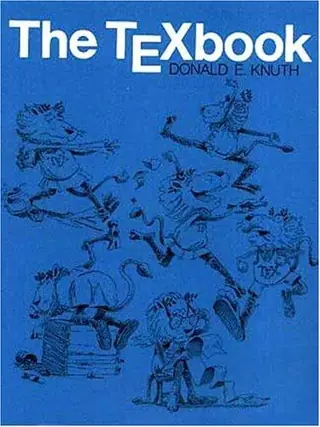 2008–2026
The TeXbook
Donald Knuth
Recommended by 25 · mentioned by 4325 recommend · 43 mention25 recommend · 4325 recommend
 2007–2026
The art of computer programming
Donald Knuth
Recommended by 336 · mentioned by 1,125336 recommend · 1,125 mention336 recommend · 1,125336 recommend
 2007–2026
Concrete mathematics
Ronald L. Graham, Donald Knuth, Oren Patashnik
Recommended by 140 · mentioned by 215140 recommend · 215 mention140 recommend · 215140 recommend
Knuth's Mathematical Typography is interesting too: http://projecteuclid.org/DPubS?service=UI&version=1.0...
on “Typeface As Programme” ↗I would like to second this great advice. A somewhat shorter piece of reading is 'Mathematical typography' by Knuth (published in the Bulletin of the AMS but I believe is freely available online). This article outlines the (enormous) scope of the problem (even before multilanguage typography is considered,…
on “Editing the C Standard” ↗…the early setup of tex might enjoy reading the following Knuth (1979). It's a very engaging read, for something that's technical. (Generally, Knuth is a great writer.) References Knuth, Donald E. “Mathematical Typography.” Bull. Amer. Math. Soc. (N.S.) 1, no. 2 (March 1979): 337–72.
on “The LaTeX Font Catalogue” ↗…always get a report about how intriguing it is. Beyond the material, I think a big factor is that it's simply intriguing to hear what a clear thinker spends time thinking about. 1. Knuth, Donald E. “Mathematical Typography.” Bull. Amer. Math. Soc. (N.S.) 1, no. 2 (March 1979): 337–72 https://projecteuclid.org:443/euclid.bams/1183544082
on “The TeX tuneup of 2021 [pdf]” ↗This looks really awesome. I'm curious, because I haven't seen much work built on top of Knuth and Hobby's "Most Pleasing Curve" as defined by Mathematical Typography [0] and Hobby's follow-up papers [1] [2] [3]. Has anybody investigated these? As far as I know they're just not very convenient to rasterize. [0] http://www.math.lsa.umich.edu/~millerpd/docs/501_Winter13/Kn... [1]…
on “Show HN: A new spline” ↗…Then I started to see differences. And then some looked ugly. That one in the middle, though, looked better and better, the more I studied the figure. Pretty soon, I was hooked. 1. Knuth, Donald E. “Mathematical Typography.” Bull. Amer. Math. Soc. (N.S.) 1, no. 2 (March 1979): 337–72.
on “The Errors of TeX [pdf] (1989)” ↗…understanding[^1]. When the rest of the industry was perfectly content with the deterioration of typesetting, Knuth set out to capture the aesthetics of the best journals of the past. A quote from the Mathematical Typography paper I linked above (https://websites.umich.edu/~millerpd//docs/501_Winter13/Knut...): > At this point I regretfully stopped submitting papers to the American Mathematical Society, since the finished…
on “The Letter S, by Donald Knuth [pdf]” ↗…phototypesetting, is dissatisfied with typography and excited by the possibility of getting it right with digital typesetting). Plans to have galleys ready in the summer :-) 1978 January: Gives Gibbs lecture (“Mathematical Typography”) on his ongoing research, unexpectedly many people are excited and want to use TeX. 1978: Finishes first version of TeX (aka TeX78, in SAIL) 1980: Starts work on rewrite of TeX (so that it can be used…
on “Donald Knuth: Algorithms, Complexity, Life, and the Art of Programming [video]” ↗…and all the debates on Debian/FSF mailing lists etc if you're morbidly interested[6]; the discussion usually proceeds on similar lines and I hope it doesn't get repeated here. :-) [1]: Gibbs lecture, “Mathematical Typography”: https://doi.org/10.1090/S0273-0979-1979-14598-1 [2]: https://en.wikipedia.org/w/index.php?title=New_Typesetting_S... [3]: https://tex.stackexchange.com/questions/385645/is-nts-new-ty... [4]: http://mirrors.ctan.org/info/knuth-pdf/tex/tripman.pdf…
on “Pure Java Typesetting System” ↗