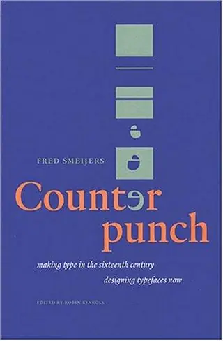
Counterpunch
by Fred Smeijers · first published 1996
2mentions
2recommended by
2HN commenters
2013–2021first – last mentioned
100% recommend
Affiliate links. As an Amazon Associate I earn from qualifying purchases.
…you ask, and it's hard to condense it into just a few rules (though this book is one such attempt). Here's some refs on typography: Just My Type - a fun introduction to the subject for the layperson Counterpunch by Fred Smeijers - perhaps a bit dry, but I found it engaging, a history of type The Elements of Typographic Style - perhaps a bit dry, but informative Those books go into detail about different types…
on “Practical Typography” ↗…written by pen; &c. So in some sense, some letters do start with skeletal forms, but: when letters were adapted to print, the punches (the "master copies") for letters were made by engraving and by using counterpunches (reusable tools that create particular shapes of negative space in the letter). And that's where metal (and digital) type comes from; pens and styli are more distant ancestors. [I'd highly recommend…
on “Using Computer Modern on the web (2013)” ↗